This logo design was for matrimonial mediators who just started up in Birmingham.
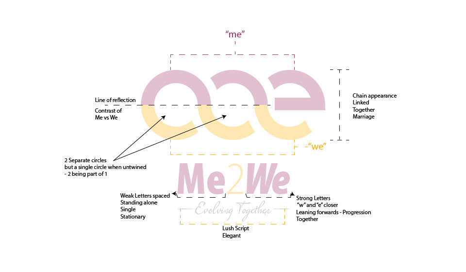
The logo shows a contrastive reflection of Me and We, intertwined with a play on the symbol of infinity. A detailed philosophy of the logo is illustrated below.
Mauve was chosen to incorporate masculine blue and feminine pink, yellow to symbolise happiness and contrasts well with mauve.
The text “Me” is using typography that shows solitary, stationary letters that are generously spaced, where as “We” has the letters closer together in an oblique format to indicate a forward movement.
The image below will illustrate the above and more.
Designed in Adobe Illustrator CC.