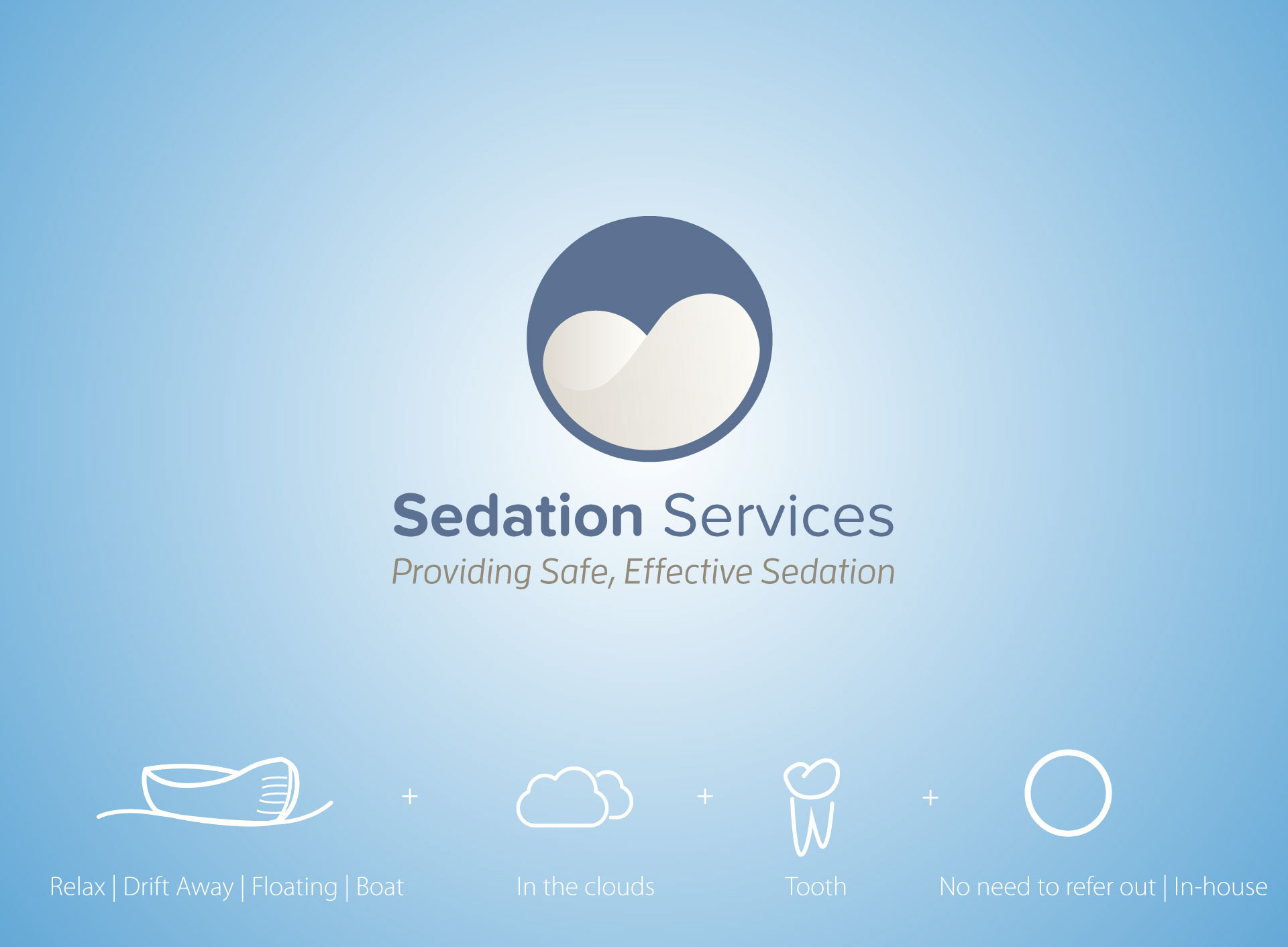
A logo that reflected patient experience of dental sedation.
The Sedation Services logo was intended to be viewed by both Dental professionals and patients.
It needed to show professionalism, yet have a personal and friendly vibe.
The Sedation Services logo was intended to be viewed by both Dental professionals and patients.
It needed to show professionalism, yet have a personal and friendly vibe.
The circle represents the in-house nature of the services provided; the team comes to you so no need to refer your patient else-where.
The artwork within the circle is a fusion of concepts that have been illustrated in the image presentation.
The artwork within the circle is a fusion of concepts that have been illustrated in the image presentation.
A round font with a darker blue colour gives off the perfect balance of being professional yet safe and friendly.
Designed in Adobe Illustrator CC